Report & Chart
A report equates a chart, which is built on a dataset based on subject. It includes following parts,
- Indicators and dimensions,
- Data filter,
- Data funnels on date/numeric/enumeration factors.
Report, meanwhile, is a dataset built by above, further rendered as a chart.
A one more important thing is after report built, it can be referred by dashboards, we will discuss it in next chapter.
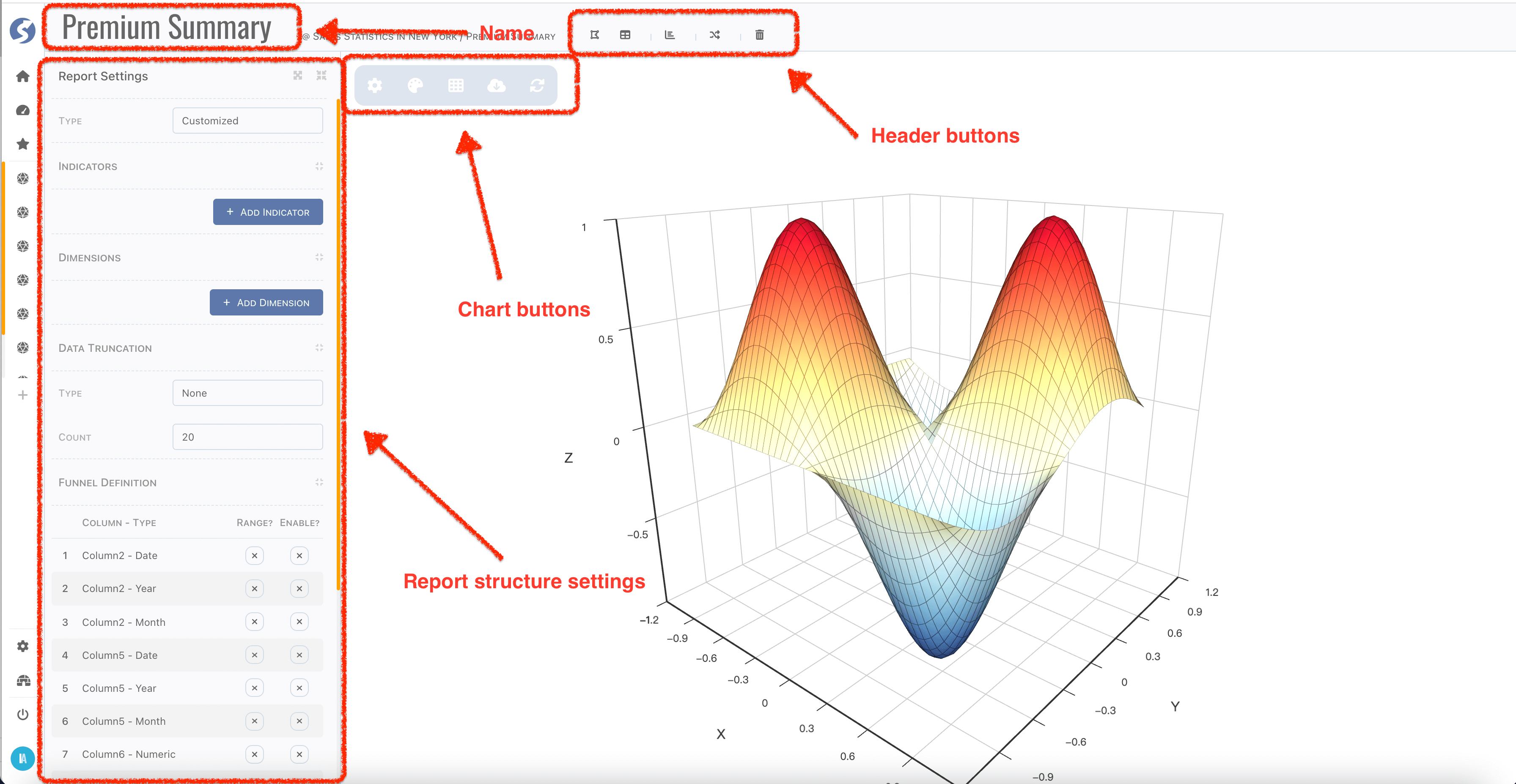
Header
Report name can be changed by click name part in header. Also, in header bar you can,
- Back to connected-space by click
Catalog, - Back to report list by click
Reports, - Create a new report by click
New Report, - Switch to another report belongs to same subject by click
Switch Report, - Delete current one by click
Delete Me.
Bottom Tabs
Switching visible of bottom bar by clicking the palette or grid button.
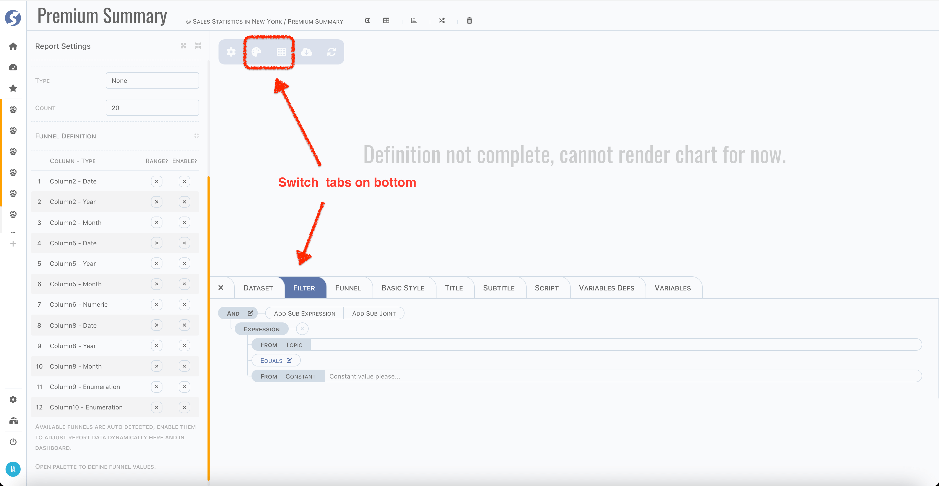
In bottom tabs, you can,
- View dataset,
- Define filter,
- Define funnel,
- Set basic style of chart,
- Set title and subtitle of chart,
- Set specific styles of chart,
- Define script, variables of customized chart.
Customizing script and variables of chart by business user is available when REACT_APP_CHART_SCRIPT_IN_CONSOLE=true (by default it is not)
.
Find REACT_APP_CHART_SCRIPT_IN_CONSOLE in .env file.
Report Structure
Report Type
First thing of define a report is deciding the report type, there are several options. We will explain each of them later, now let's have an overview, they are,
- Single Value,
- Bar,
- Line,
- Scatter,
- Pie,
- Doughnut,
- Nightingale,
- Sunburst,
- Tree,
- Treemap,
- Map,
- Customized.
Report type equates chart type, it determines count of indicators and dimensions.
Indicators & Dimensions
After type is decided, pick indicators and dimensions which you care about. For each indicator, there are five aggregation arithmetics available,
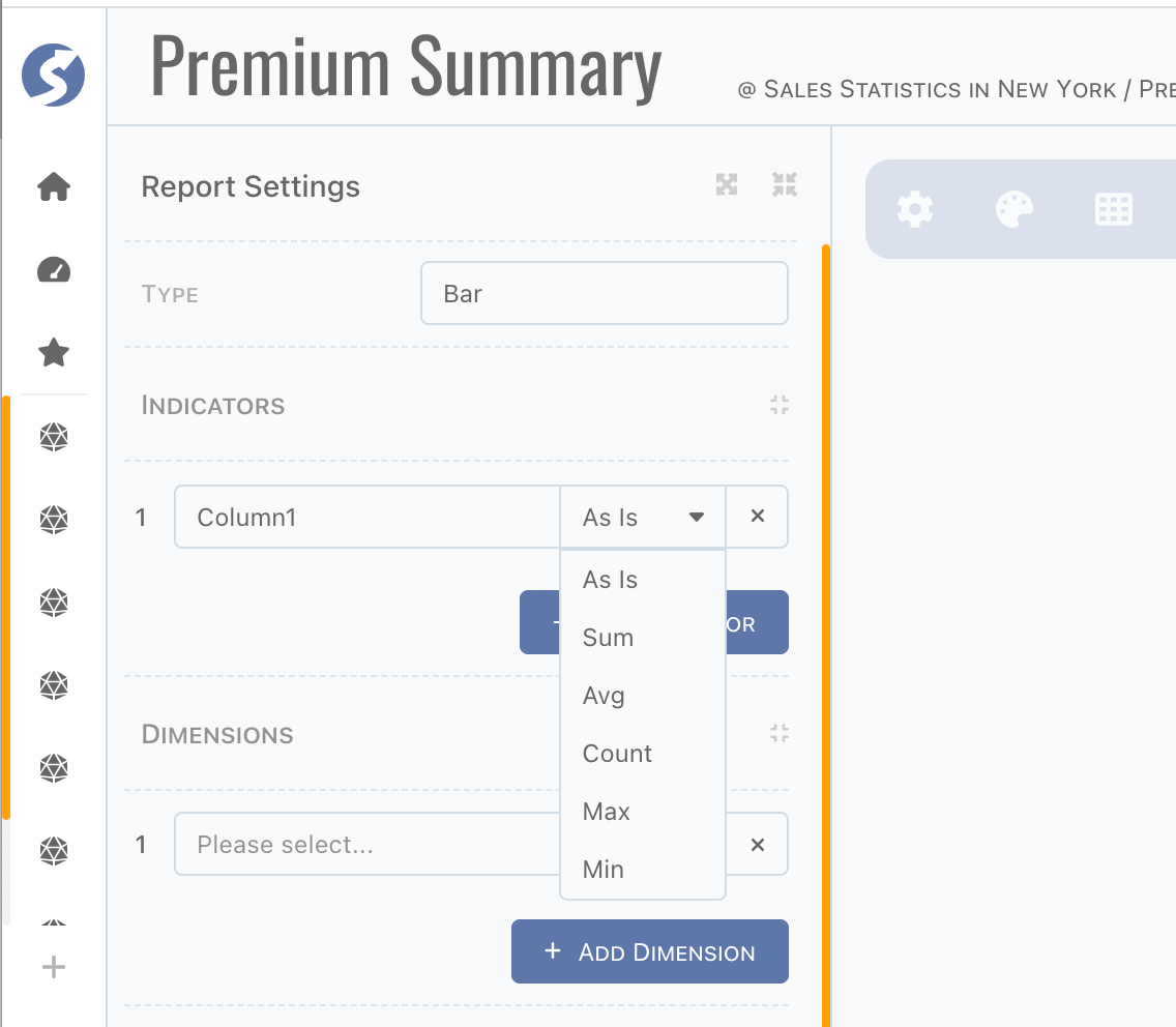
Now select dimensions, they are perspectives of data insight. Also, if there are aggregations defined on indicators, they are aggregated by dimensions.
Data Truncate
Sometimes, we don't want to discover the whole picture, we just want to know the outstanding ones. In this case, identify count of data you
want and assign the truncate type by Top or Bottom instead of None.
Filter and Funnel
Report is built based on subject, in previous chapter, we introduced how to define a subject. Actually, it is just like a SQL query from one or multiple topics. In report, data can be filtered one more time via filter and funnel.
Difference between Filter and Funnel
In anutshell, filter is static and funnel is dynamic. In runtime, filter is exactly same as it was defined. But for value of funnel, it can be passed different for each time. It is very vital in case of changing it on dashboard.
Filter
- Define criteria on subject columns here instead of factor in subject because of no topic can be seen here,
- From type of both sides on criteria is fixed, change from type is not available anymore.
Report filter is more like a simplified version of subject.
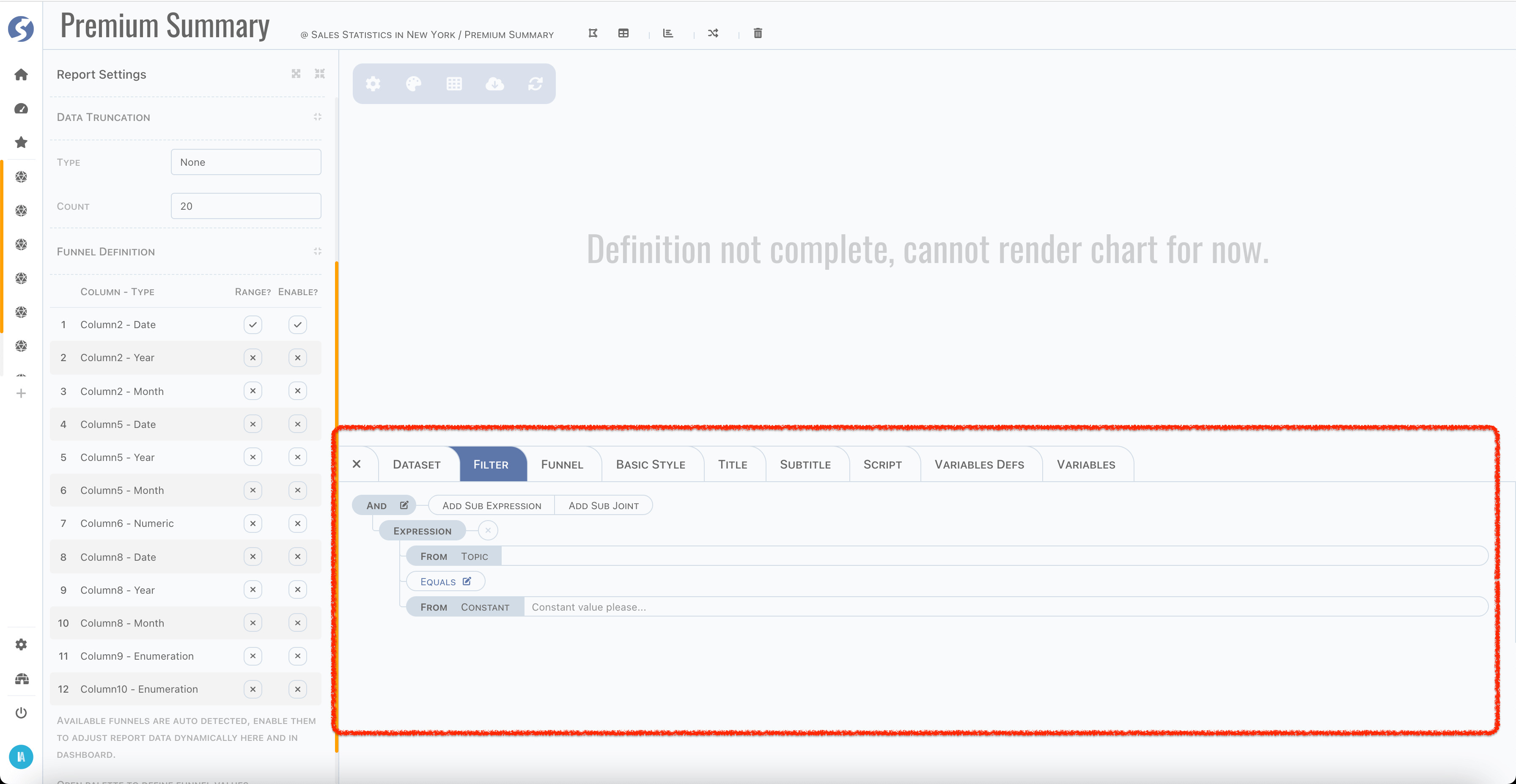
Funnel
Columns of date, numeric and enumeration will be detected automatically, list in funnel definition part.
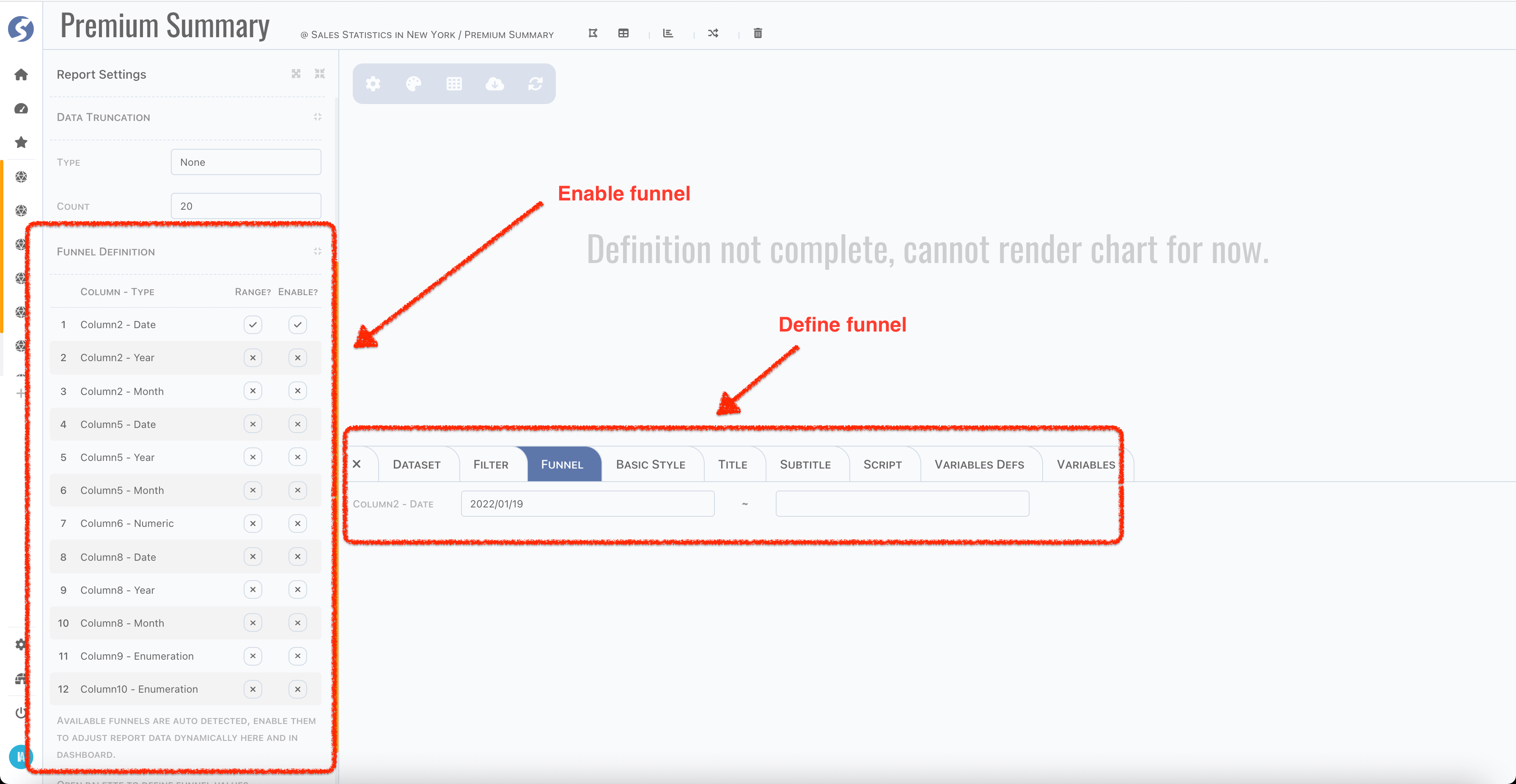
Enabled funnels are shown on bottom tabs to set default funnel values, values will be used to filter data in this page.
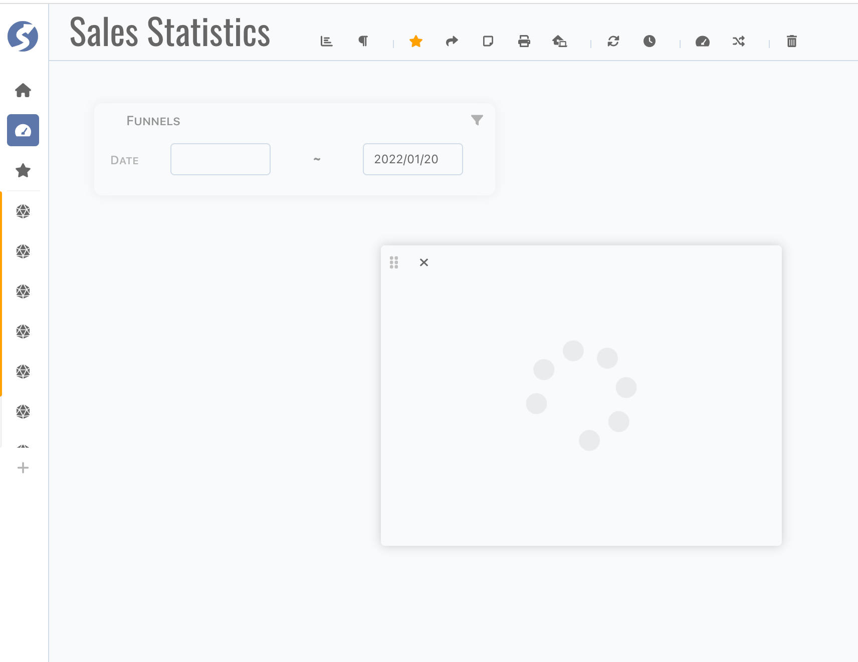
And in dashboard, we just have a quick look, funnels are available for accepting dynamic values, as below,
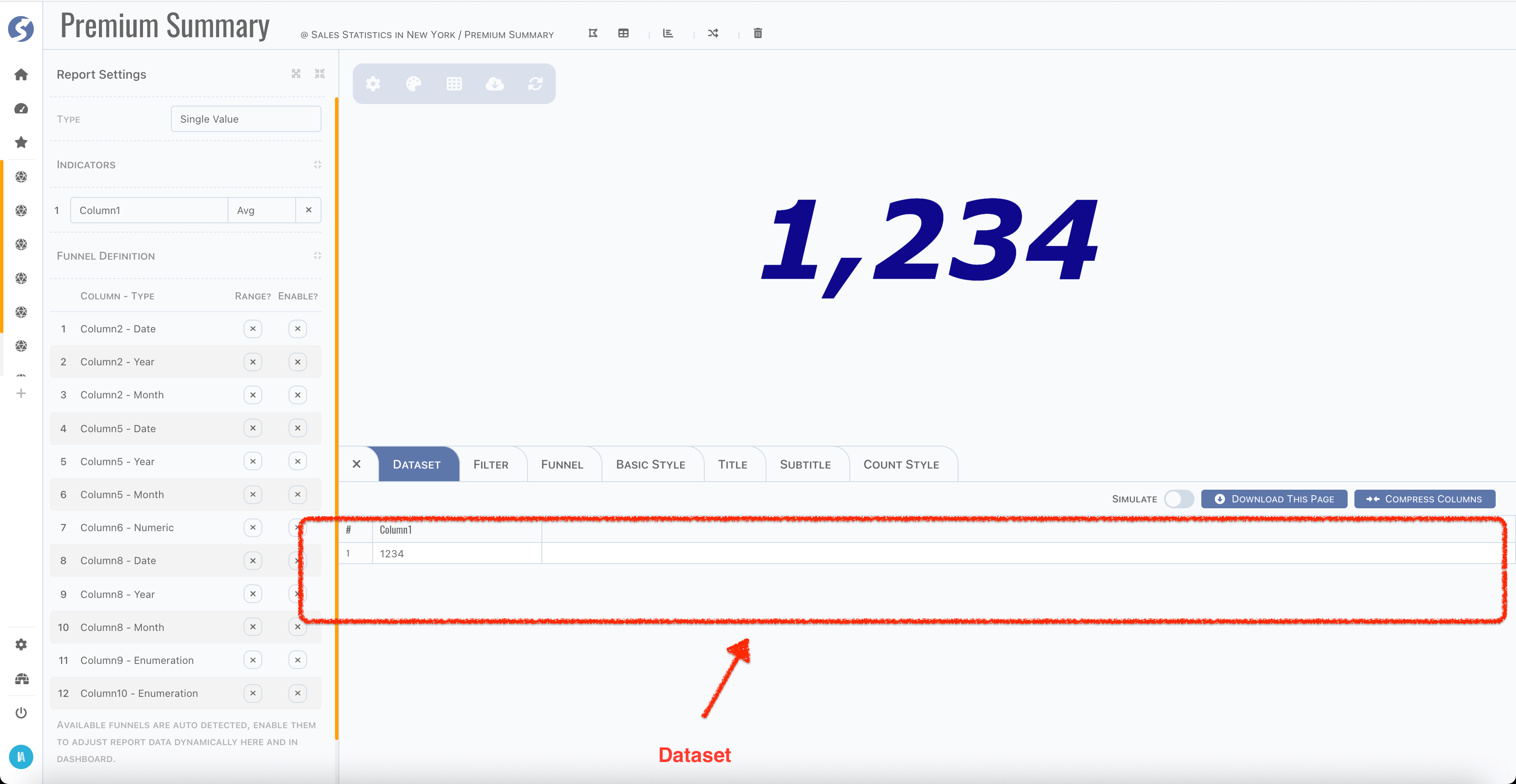
Dataset
After everything declared, now we can preview dataset to check whether it is as expected or not,
Sometimes, we want to verify the chart by simulated data instead of fetch them from server side. Simply switch on the Simulate toggle,
download data template (according to indicators definition), prepare mock data and upload them.
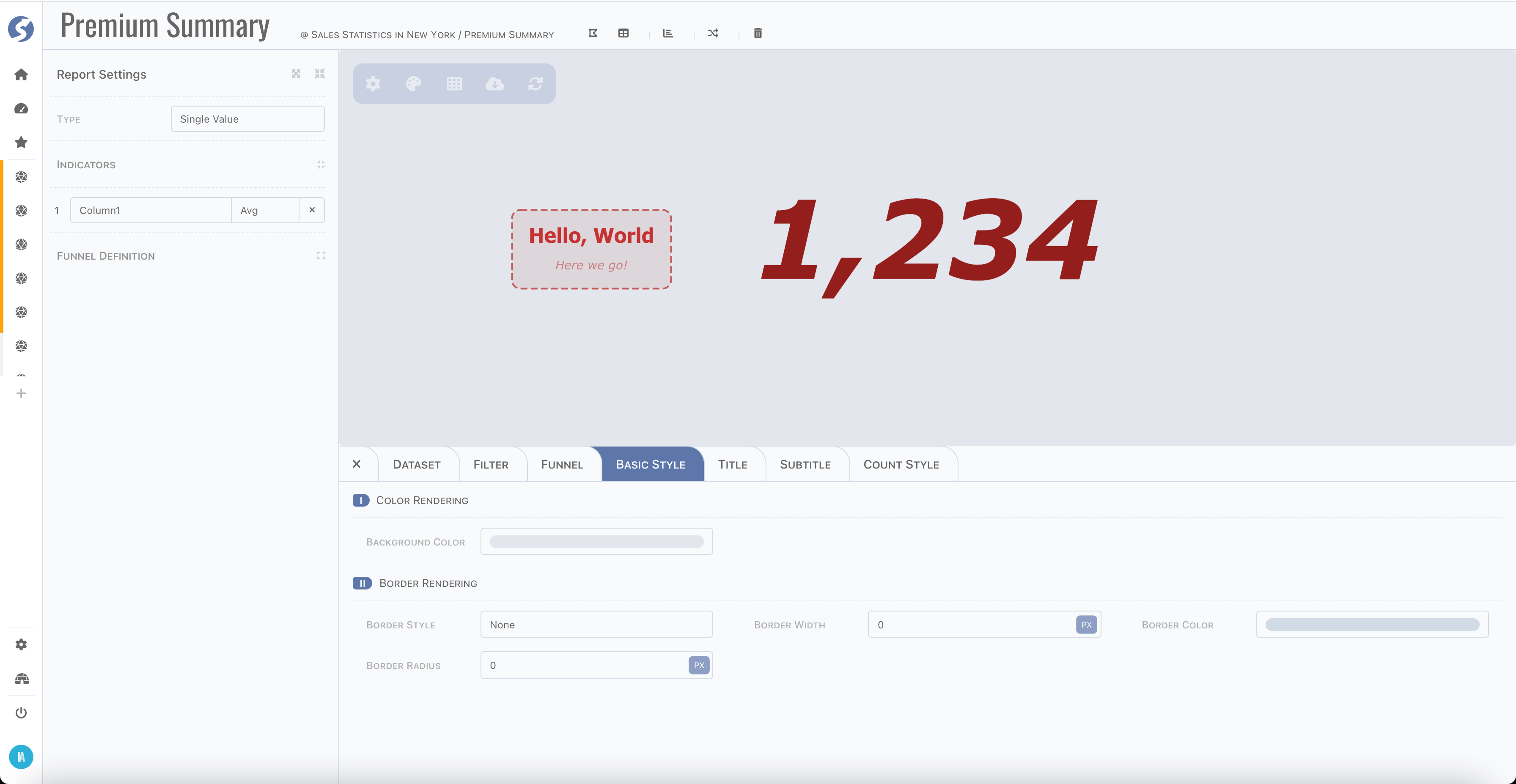
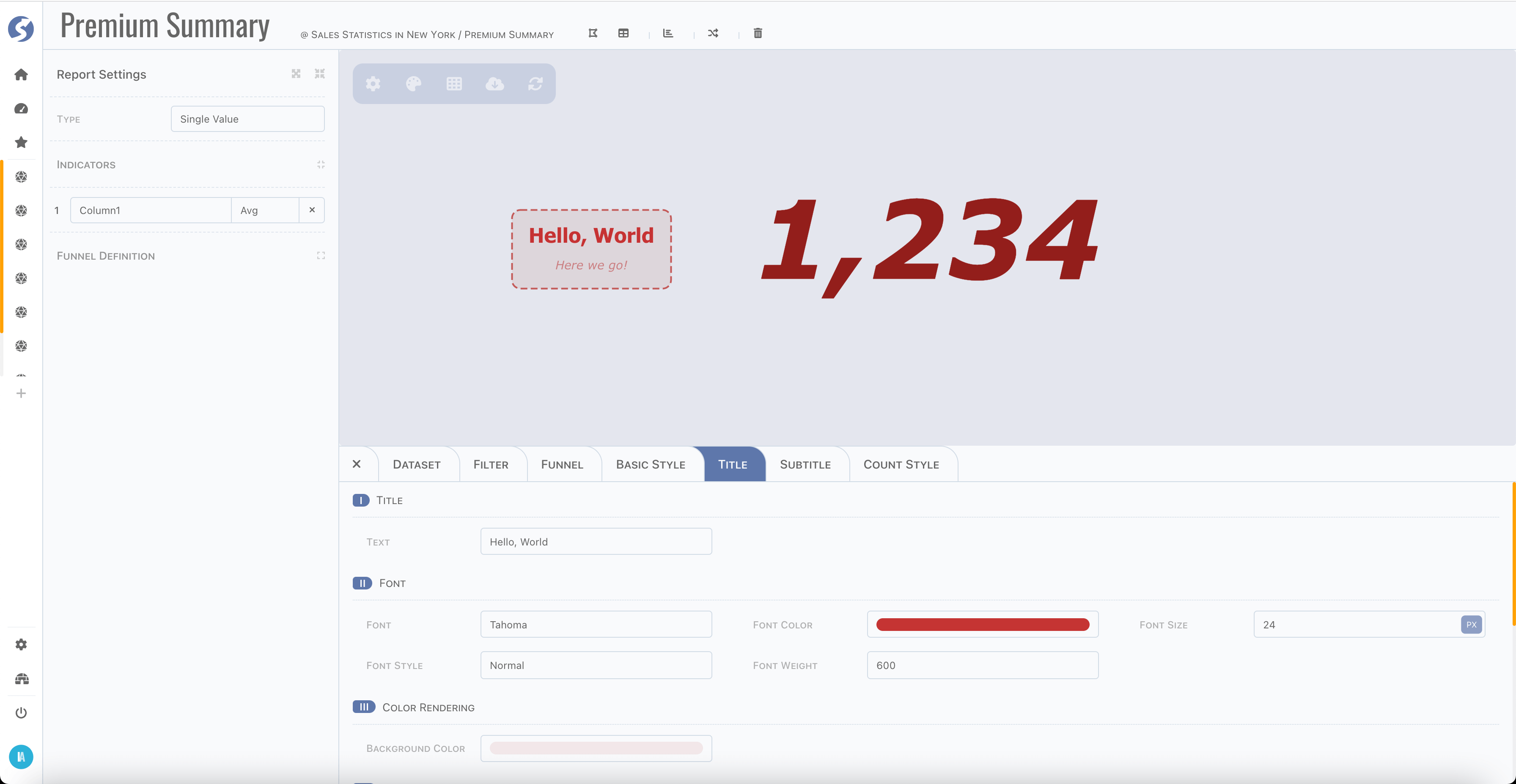
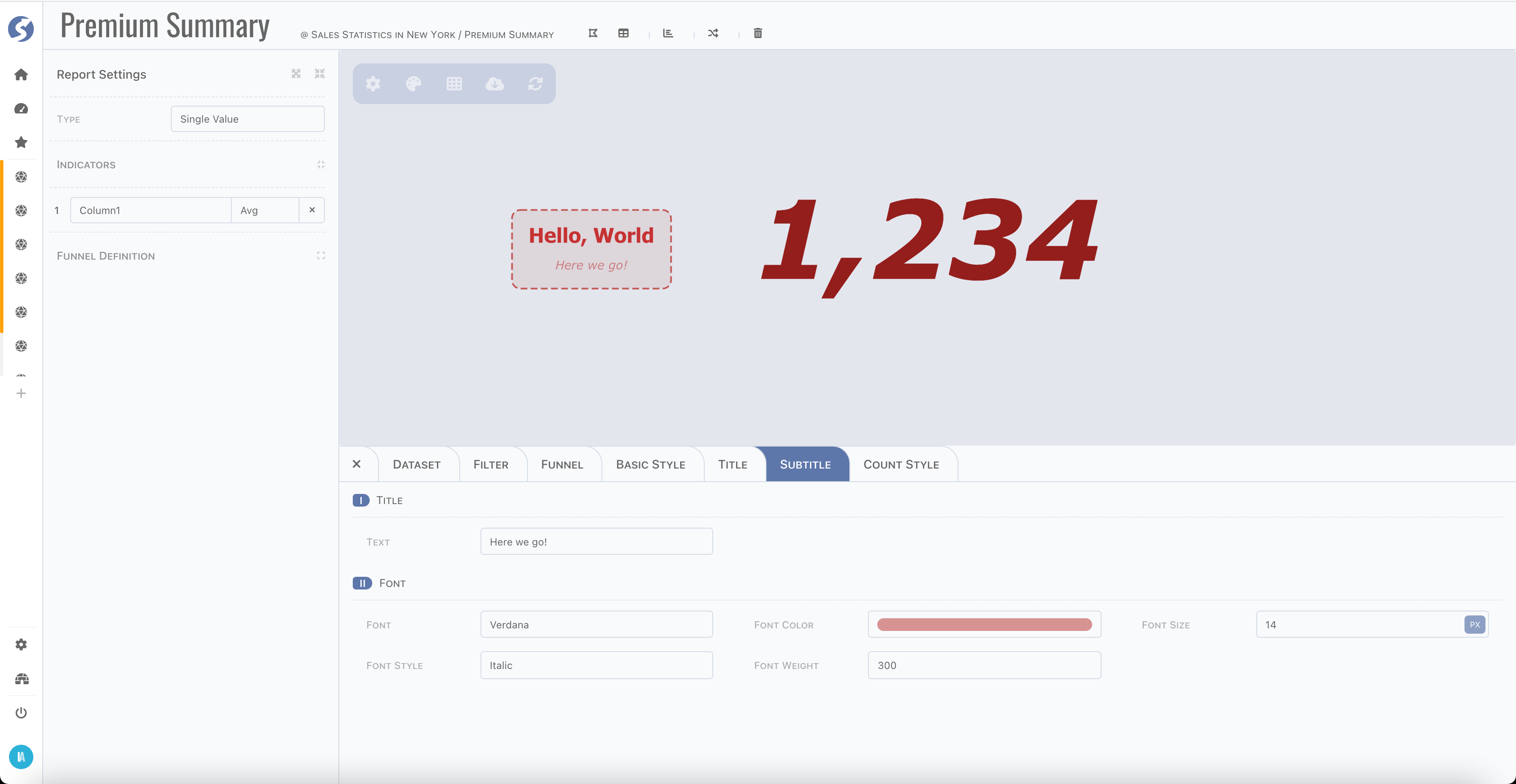
Basic Style, Title & Subtitle
For each chart, basic style, title and subtitle are available, you can find settings on appropriate tab. There are dozens of settings, we will not introduce them one by one, just try them in page.
Here are some screenshots,
Charts
Prebuilt
As we introduced in report type, there are several types of charts built-in. For each type, there is different restriction for indicators and dimensions and specific style settings are available.
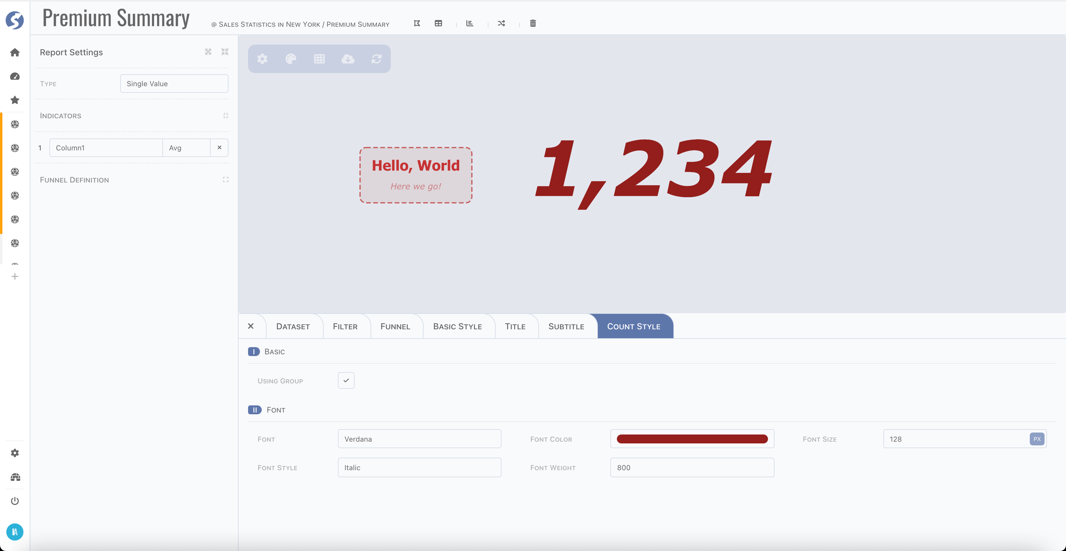
Single Value
In previous section, we have seen the common style settings, and for single value chart, there is a peculiarity tab,
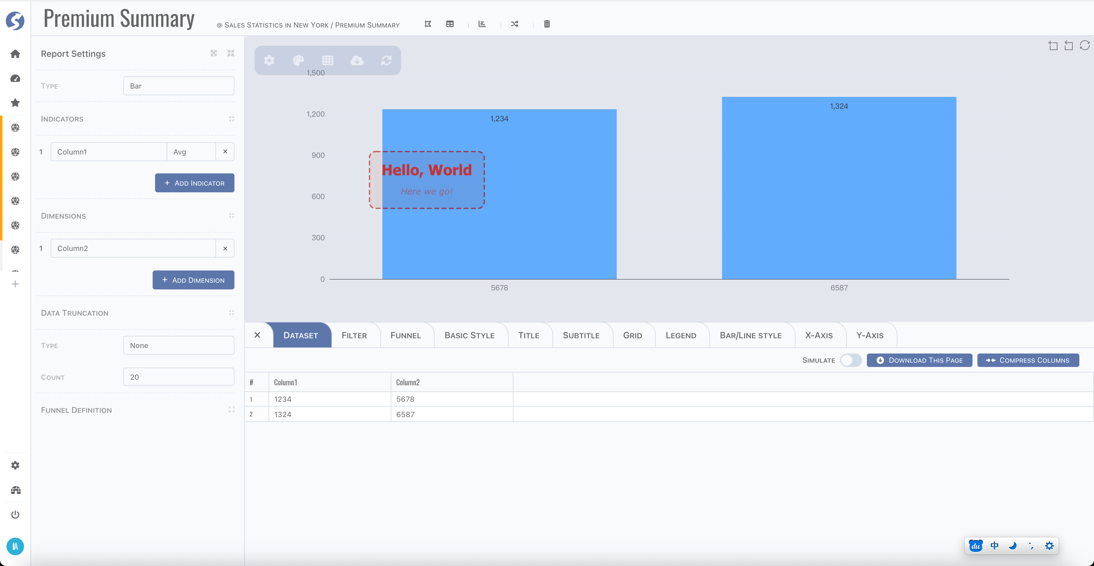
Bar
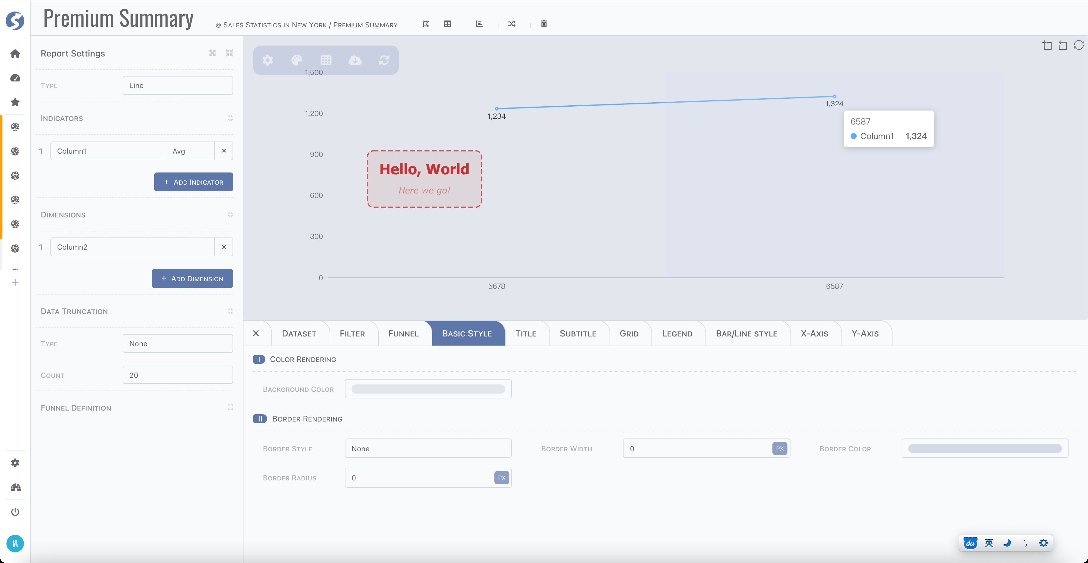
Line
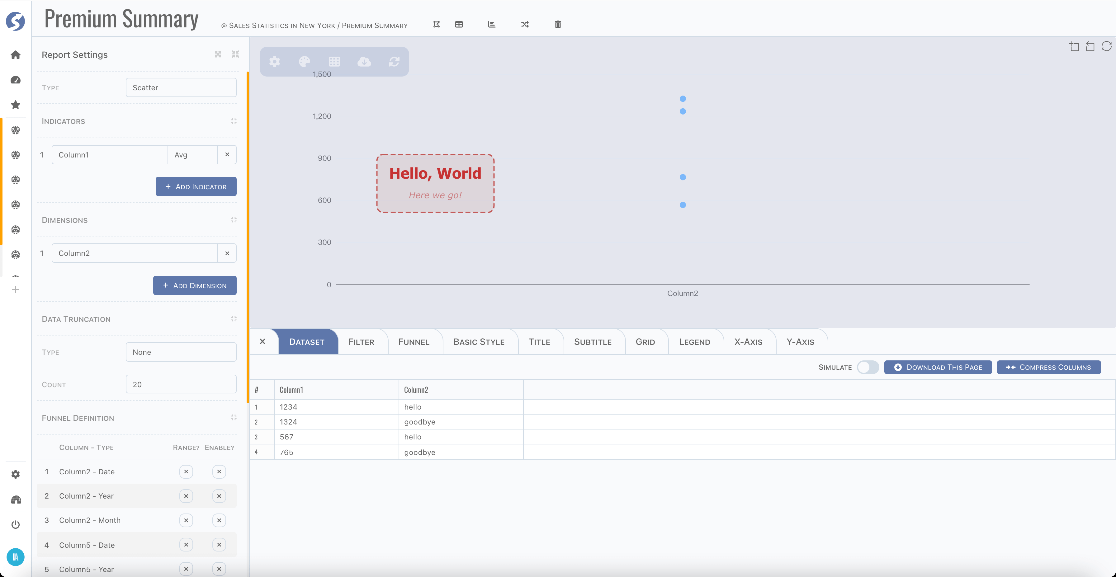
Scatter
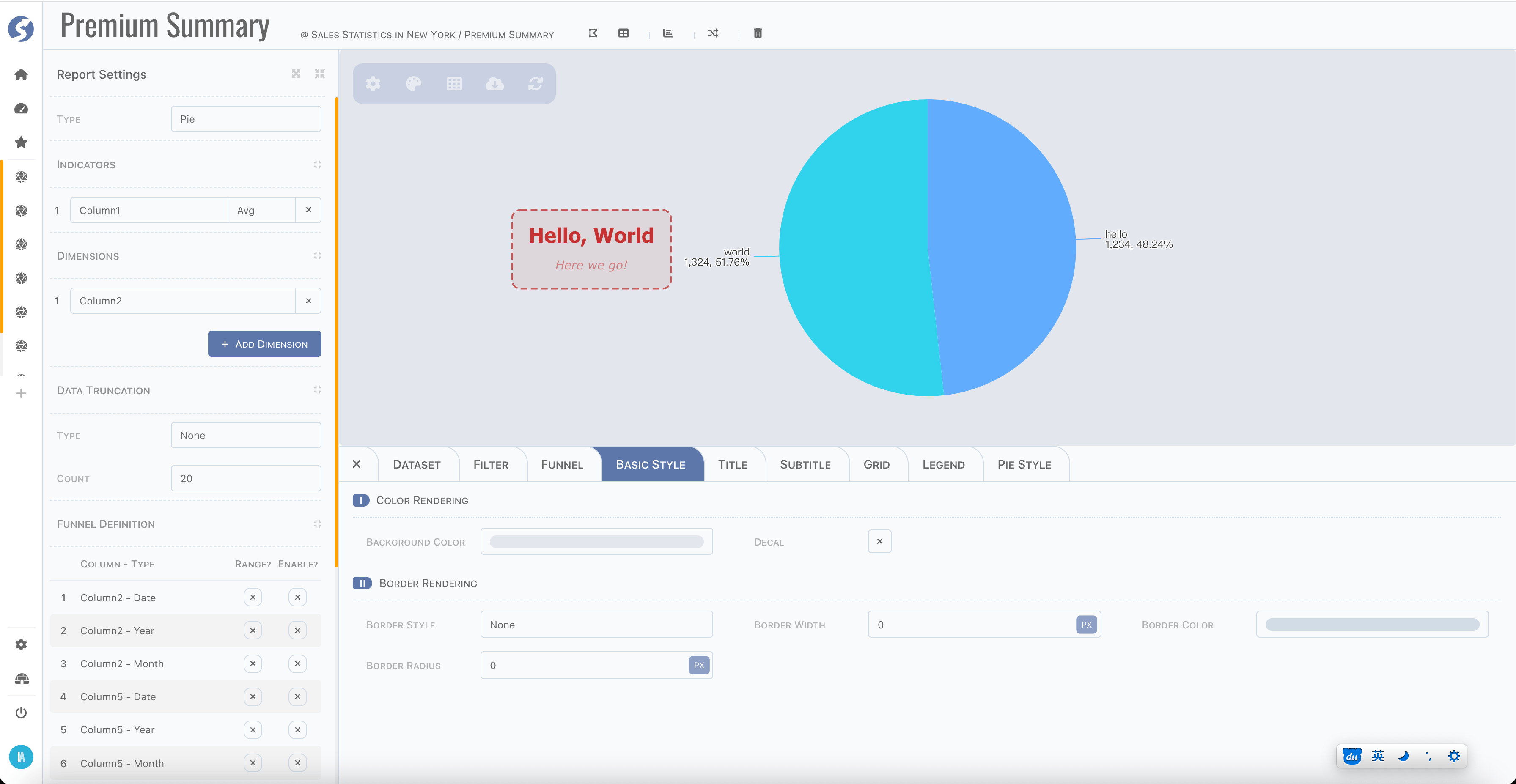
Pie
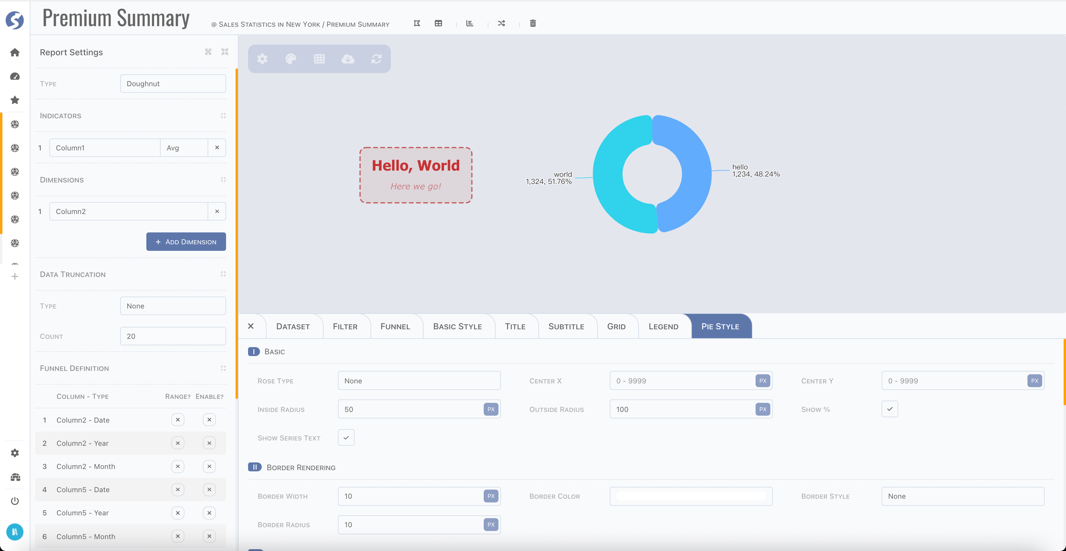
Doughnut
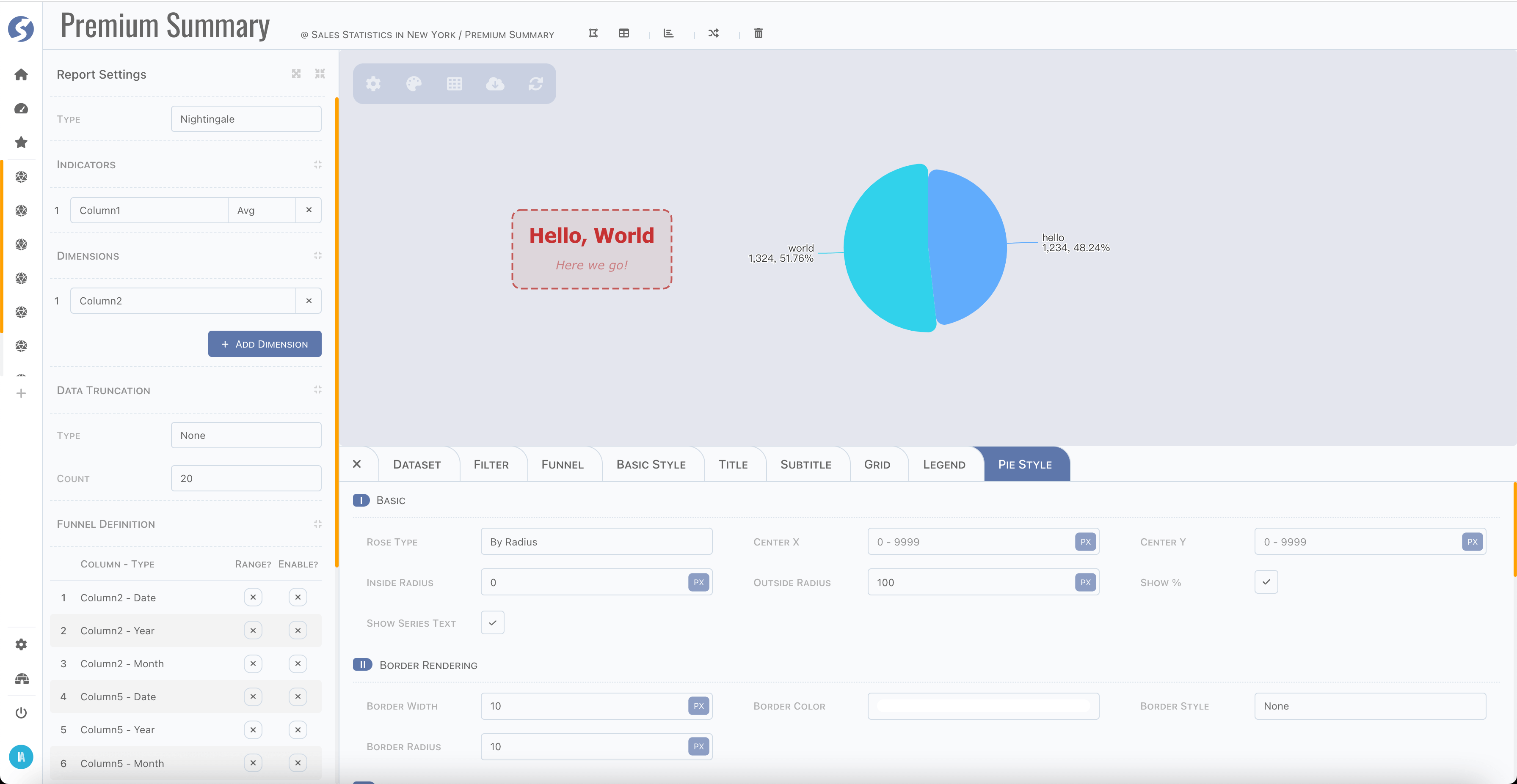
Nightingale
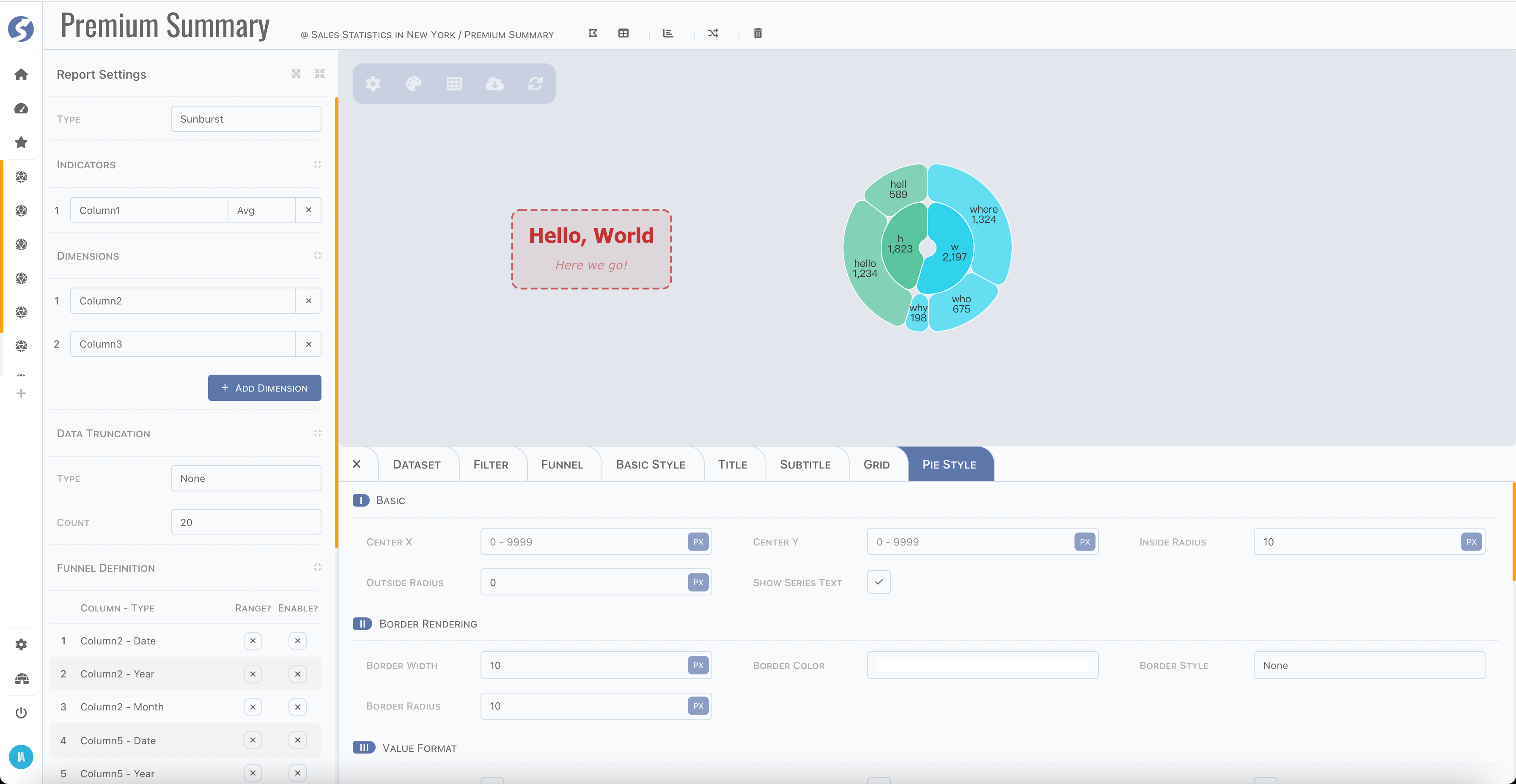
Sunburst
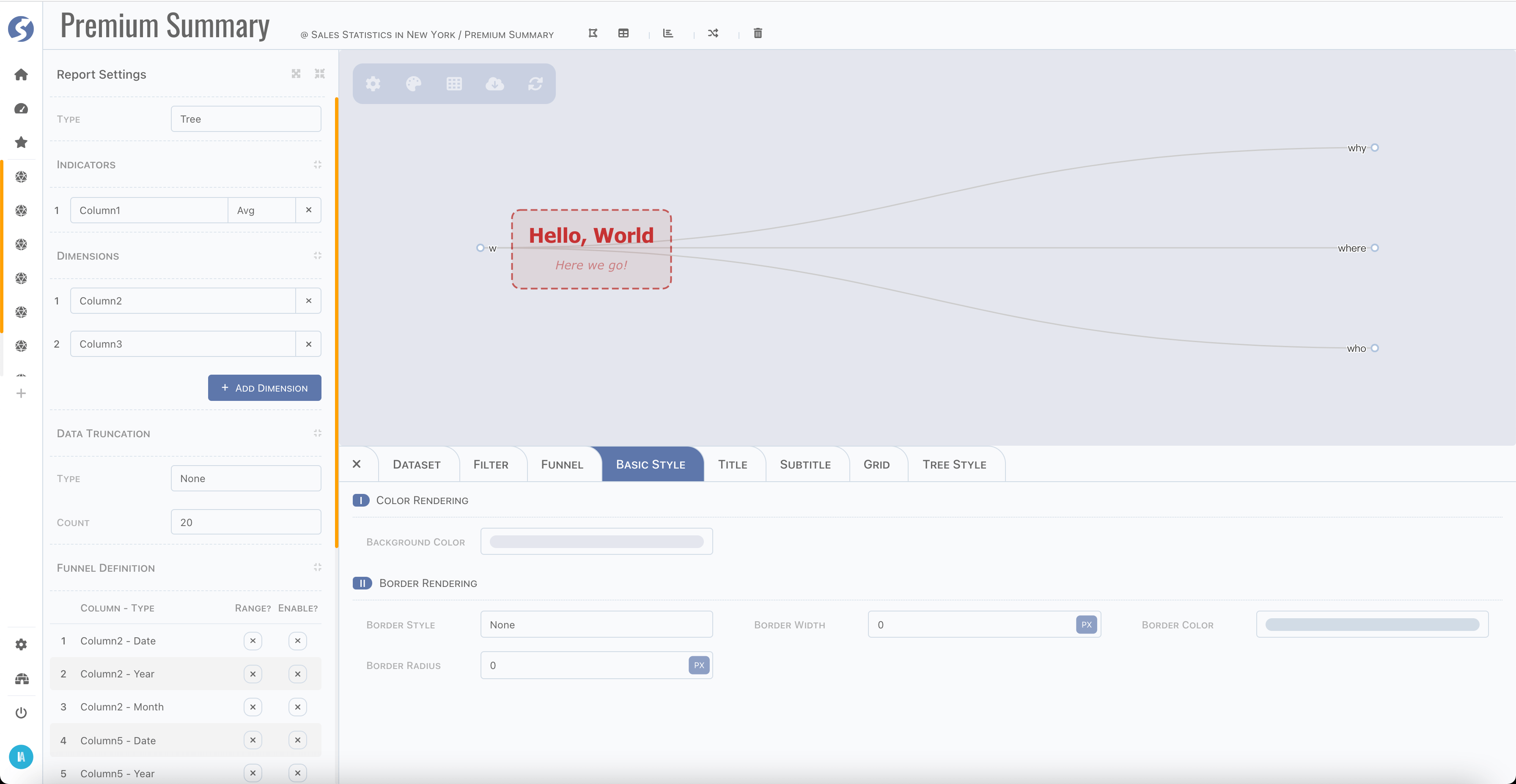
Tree
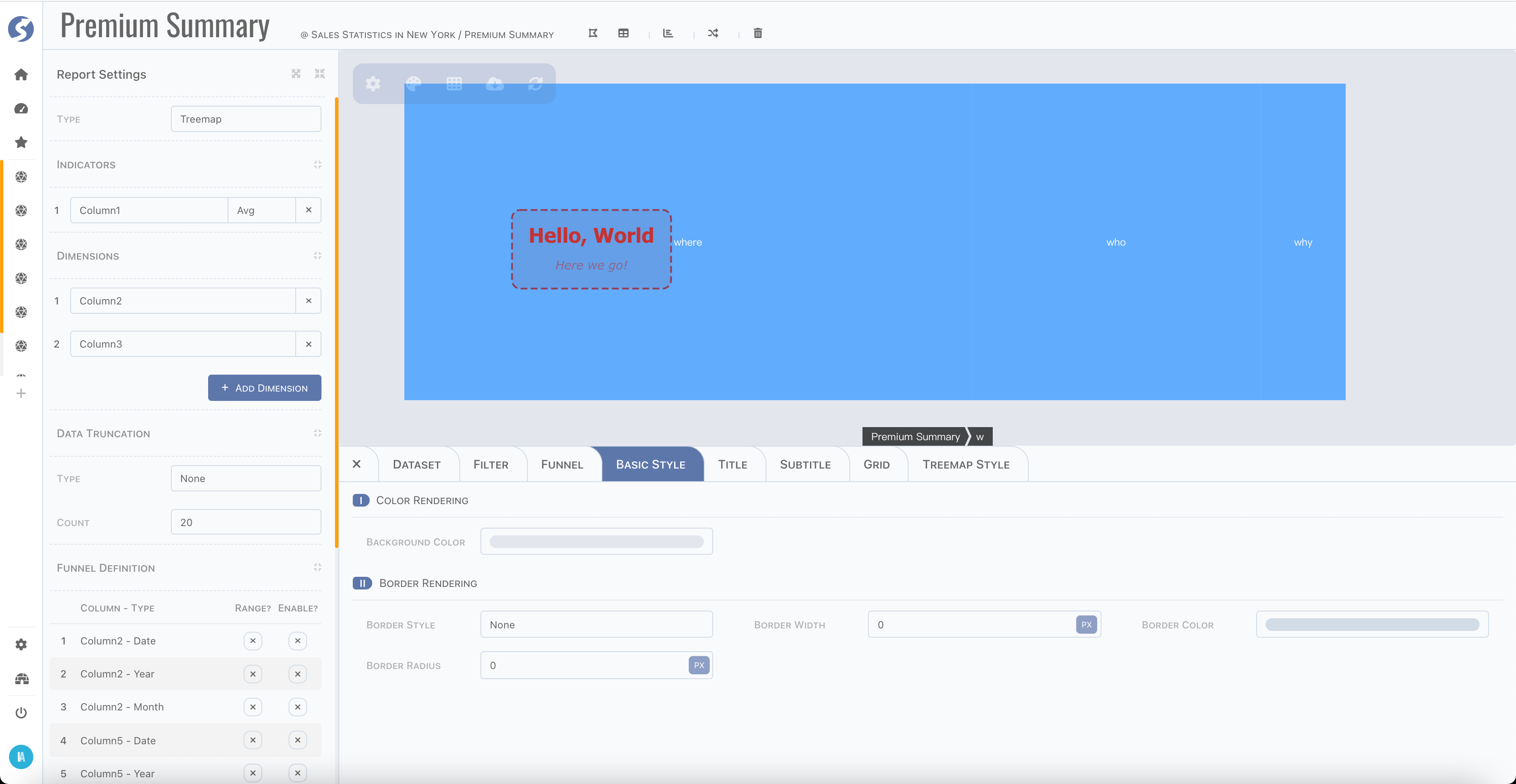
Treemap
Map
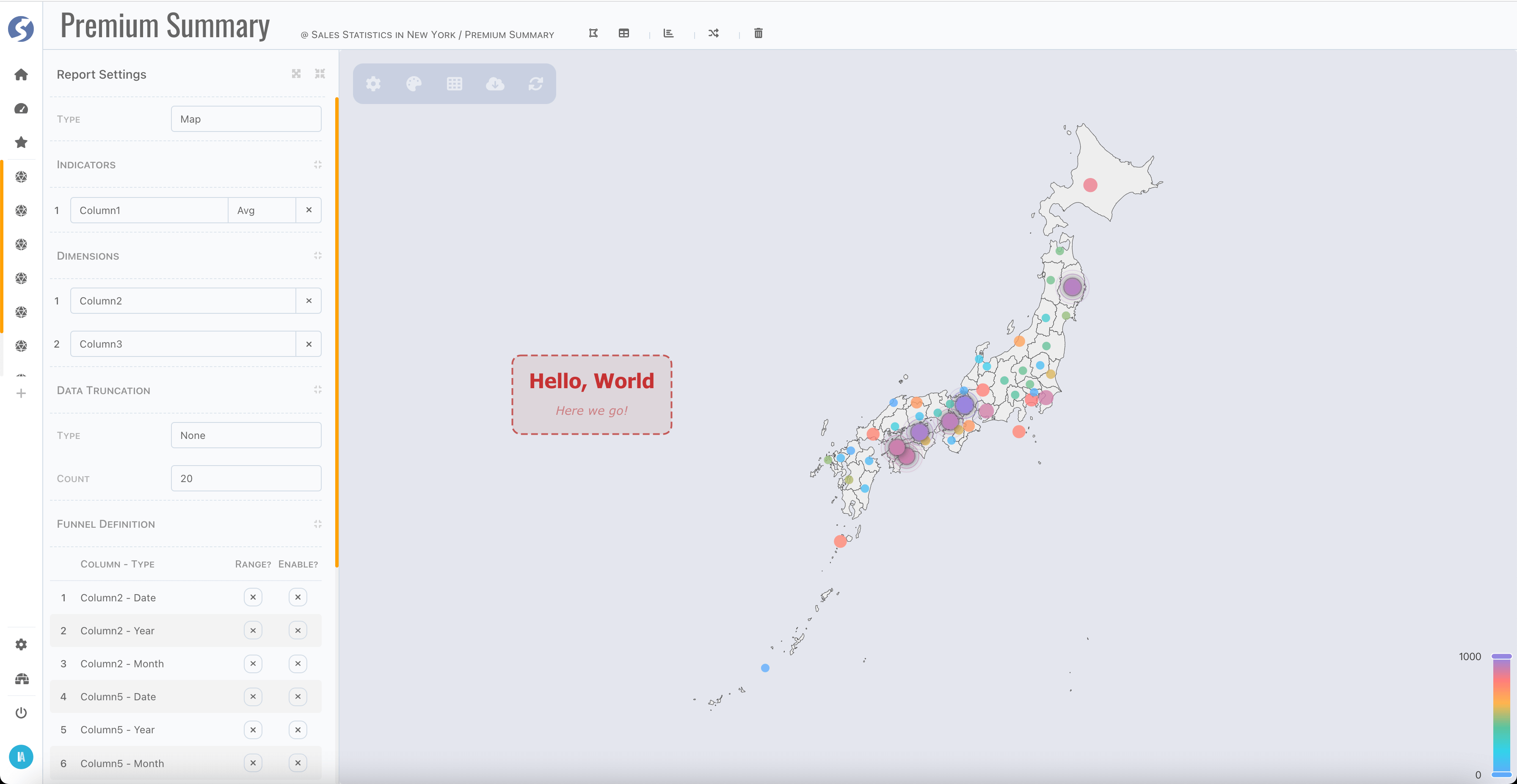
Level-1 map (in state/province level): China, Japan, Singapore and USA are built-in.
Customized
For those charts haven't built-in, could be rendered by customized type, this is tech-orientation and by default not open to business user, we recommend implementing the complex charts by your technical department and expose them to business users.
Data Structure
Follow below steps,
- First, you need to be an administrator, define a space as we introduced here, make sure it is assigned to yourself and business users who will use this customized chart.
- Switch to console workbench, connect this space,
- Create a subject and create a report, simply following the standard process,
- Select report type as
Customized, - Select indicators/dimensions/filters/funnels, and set truncate if needed, just as normal,
- Set basic style/title/subtitle, also as normal.
Chart Script
Now we have dataset for this report, open bottom bar, find script tab,
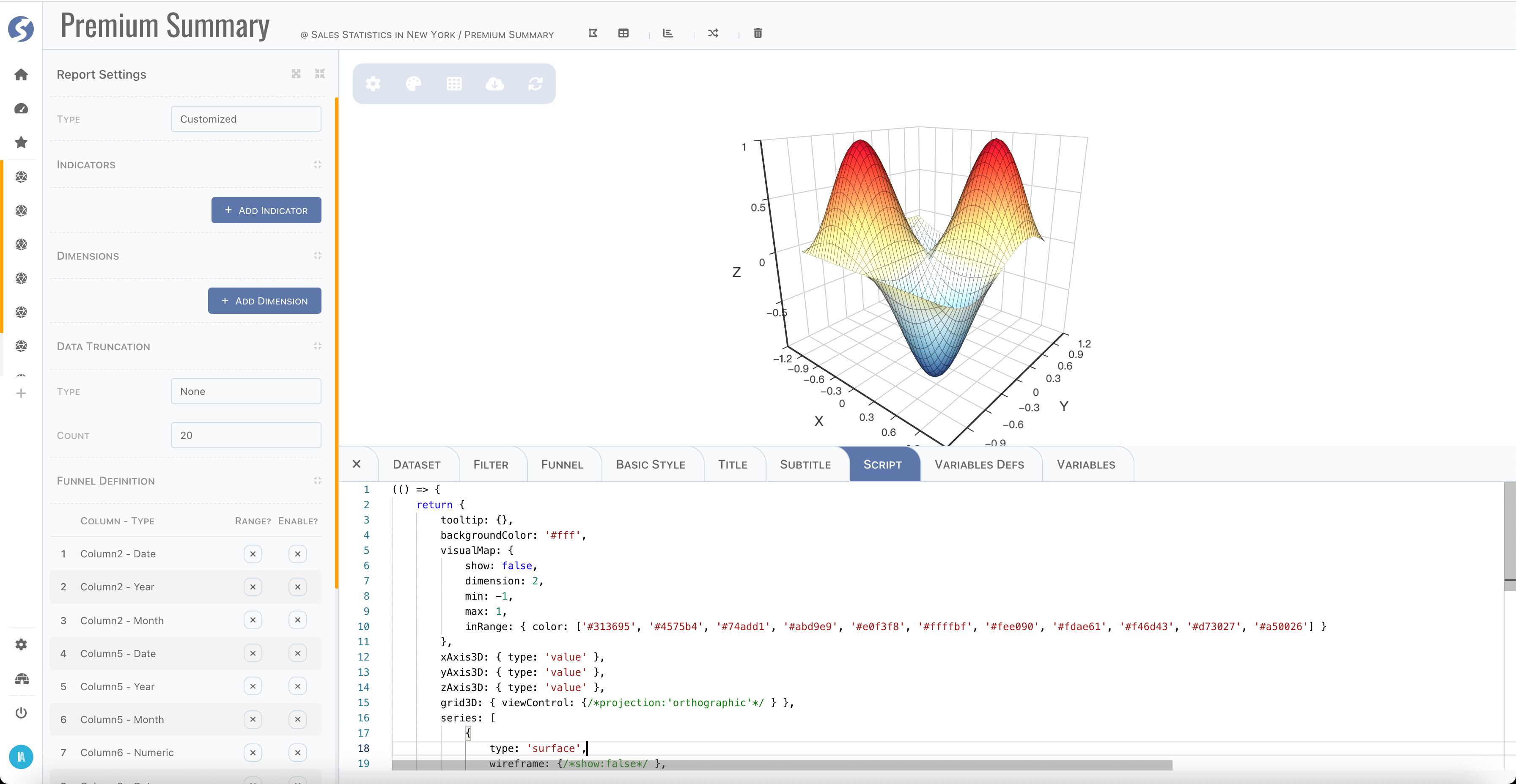
Watchmen use echarts as chart engine, so in this script, a valid echarts options must be returned. Since script will be run in browser, which means please strictly follow the javascript syntax supported by your browser version, it can be found at CanIUse.
(() => {
	return {              // this is what the echarts needed
		/** ... */
	};
})();
To build echarts options in script, there is one more parameter options is passed into this function. Typically, structure as below,
{
	color: [],
	// colors
	data: [],
	// dataset, 2 dimensions array
	title: {},
	// title defined in title/subtitle tabs
	vars: {}
	// variables
}
Use these data to build new options and return to engine to render chart.
Define Variables
When defining a customized charts, sometimes there are some dynamic variables want to expose to business users, so they can change the
rendering behavior through giving values of these variables by their own. There is a Variables Defs tab to do this,
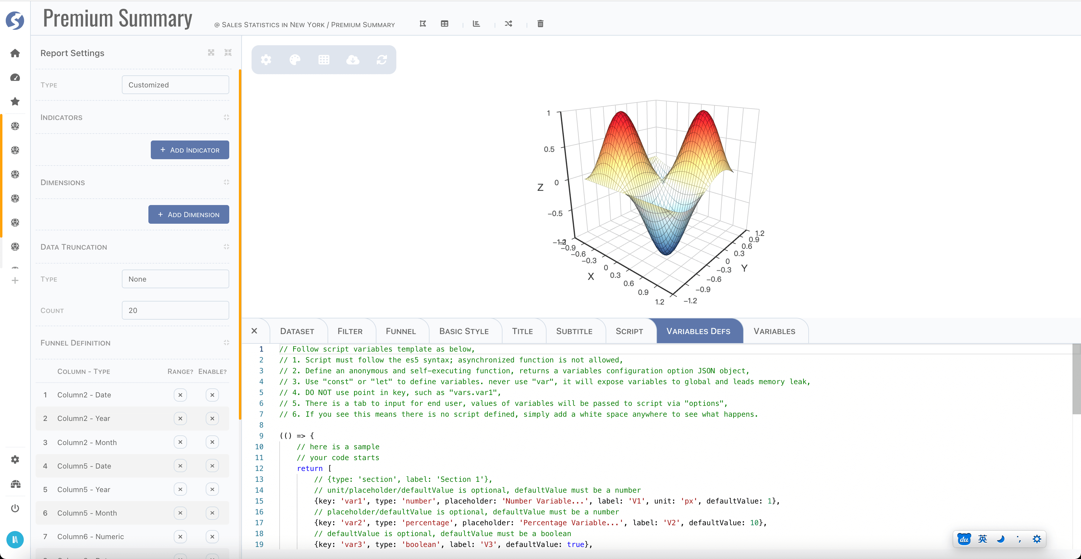
Let's see a complete sample,
(() => {
	// your code starts
	return [
		// unit/placeholder/defaultValue is optional, defaultValue must be a number
		{key: 'var1', type: 'number', placeholder: 'Number Variable...', label: 'V1', unit: 'px', defaultValue: 1},
		// placeholder/defaultValue is optional, defaultValue must be a number
		{key: 'var2', type: 'percentage', placeholder: 'Percentage Variable...', label: 'V2', defaultValue: 10},
		// defaultValue is optional, defaultValue must be a boolean
		{key: 'var3', type: 'boolean', label: 'V3', defaultValue: true},
		{type: 'section', label: 'Section 2'},
		// placeholder/defaultValue is optional
		{key: 'var4', type: 'text', placeholder: 'Text Variable...', label: 'V4', defaultValue: 'abc'},
		// defaultValue is optional, defaultValue must be css color
		{key: 'var5', type: 'color', label: 'V5', defaultValue: '#ff0000'},
		// placeholder/defaultValue is optional, defaultValue must match one of options
		{
			key: 'var6',
			type: 'dropdown',
			placeholder: 'Dropdown Variable...',
			label: 'V6',
			defaultValue: '1',
			options: [{value: '1', label: 'Option 1'}, {value: '2', label: 'Option 2'}]
		}
	];
	// your code ends
})();
Also, it will be compiled and run on browser side, make sure it is strictly following the javascript syntax supported by your browser version. There are several types supported, variable declaration contains,
key: make sure it is unique,type,number: numeric value, rendered as an input,unit: only fornumber,
percentage: a numeric value, rendered as an input,percentageis anumberwith unit is%,
boolean: a boolean value, rendered as a checkbox,text: a string value, rendered as an input,color: a color value, rendered as a color picker,dropdown: value type according to options, number/string/boolean are supported. It is rendered as a dropdown.options: options for dropdown,
placeholder: a string to describe meaning of this variable,label: variable label,defaultValue: default value of variable.
Variables
Defined variables will be rendered in Variables tab as below,
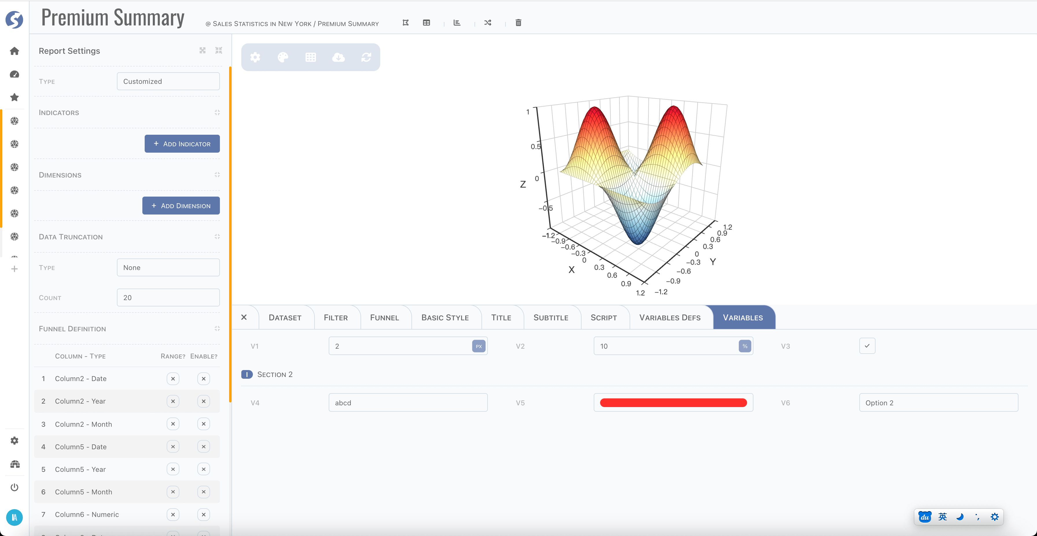
And they will be passed as options.vars to chart script, like,
(() => {
	console.log(options.vars);
	// in browser console, will see
	// {var: 1, var2: 10, var3: true, var4: "abc", var5: "rgba(255,0,0,1)", var6: "1"}

	return {                        // this is what the echarts needed
		/** ... */
	};
})();
Summary
Script and Variables Defs tabs are available for admin only by default, they can be open to business users when build and deploy
by REACT_APP_CHART_SCRIPT_IN_CONSOLE=true. It is tech-orientation, and make sure that your business users understanding how to use this
before you decide to open it, they must learn the part of Javascript and echarts, it's easy to a programmer, but not that easy to others.
Another thing is, if script is not open to business users, then they cannot change the structure of report, which means chart type,
indicators and dimensions is immutable, and filter and funnel still can be changed as normal.